Inkscape: Draw Graphics That Stay Sharp
- Vector graphics
- Design
- Open source
A small graphic looks fine until you need a bigger version. Then the tidy icon becomes a collection of fuzzy squares and the “quick adjustment” starts looking suspiciously like redrawing everything.
Inkscape is a free, open-source vector graphics editor. Instead of treating every mark as a fixed patch of pixels, it lets you work with shapes and paths. That makes it useful for diagrams, labels, icons and other graphics where you want clean edges and the freedom to keep changing the design.
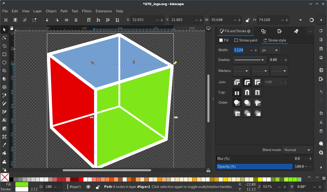
Inkscape 1.3: toolbox on the left, canvas in the middle, and a vector drawing that stays sharp at any size. Source: Wikimedia Commons.
Objects rather than a painted grid
A vector rectangle remains a rectangle with editable dimensions, colour and outline. You can move it, enlarge it or change its shape without repainting each edge. Text, paths and other objects give you building blocks for a composition.
That does not mean every image placed in an SVG becomes infinitely sharp. If you import a small photograph, the photograph still has its original pixel limits. Vector editing is most helpful when the actual artwork is built from vector objects.
For a first project, choose something modest: a labelled diagram, a simple badge or a clean icon. You can learn a great deal from arranging a few shapes without committing to a detailed illustration on the first evening.
Make one shape do useful work
The official basic tutorial starts with navigation, shape tools and selection. Draw a rectangle or ellipse, select it and change the fill and stroke. The fill is the inside; the stroke is the outline. Keeping those separate is a small concept with a large practical payoff.
Then try moving, resizing and rotating the object. Preserve proportions when that matters, and use the numeric position and size fields when the design calls for something more precise than “roughly there”.
Do not judge an unfamiliar tool by how quickly you can reproduce a polished illustration. A first useful exercise is a clean box with readable text and a sensible outline. That is already enough for plenty of practical graphics.
Alignment beats heroic mouse control
Once you have several objects, use alignment tools to make their relationships deliberate. Equal spacing and shared edges usually look better than a series of almost-correct placements made while squinting at the canvas.
Group related objects so a label and its background move together. Grouping keeps pieces associated without turning them into one permanently flattened picture. You can still work on individual elements when needed.
Stacking order matters too. An object placed above another can hide it, even when both are present in the document. If something seems to have vanished, check the order before creating a second copy. Otherwise the missing object tends to reappear at exactly the least convenient moment.
Keep the SVG, export the delivery copy
Inkscape uses SVG as its native format. Keep that editable source when you want to revise the artwork later. An exported PNG is useful for places that expect a conventional image, but it is not a replacement for the objects and structure in the original document.
Before exporting, check which area is being exported and what dimensions the destination needs. A perfectly drawn icon can still arrive with excessive empty space or at an unhelpful size if the export area is wrong.
Open the exported file somewhere outside the editor. Inspect small text, thin lines and the background. A design that looks comfortable while zoomed in may be unreadable at the size people will actually see. For print work, confirm the printer's required format and colour workflow rather than assuming every SVG or PNG is suitable.
A good fit for practical graphics
Inkscape is particularly appealing when the task involves shapes, labels and repeatable geometry. It is not a shortcut around learning composition, and it is not the same kind of tool as a pixel-based painting application.
I would begin with one real task and a small set of tools: shapes, text, fill and stroke, alignment and grouping. Learn paths when the project needs them. You can make a useful diagram long before you know what every toolbar button does.
The reward is a source file you can revisit rather than a flat image you have to rebuild. Start with the official basic tutorial and FAQ for the current tools and format guidance.